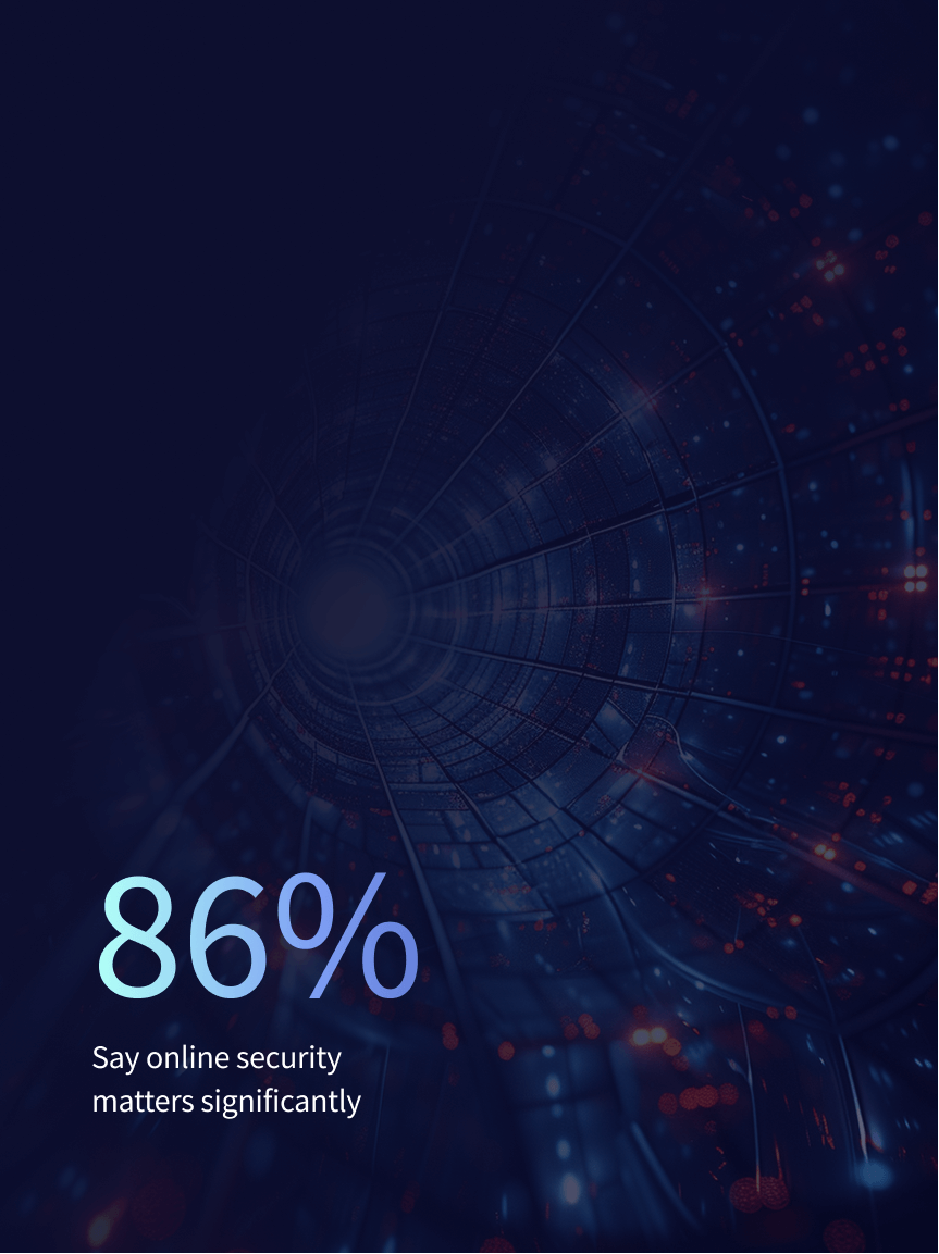
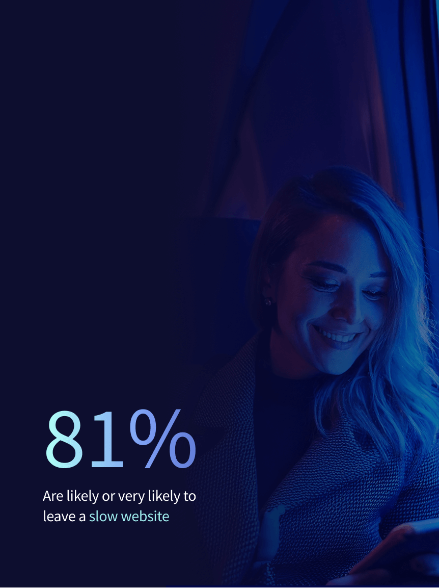
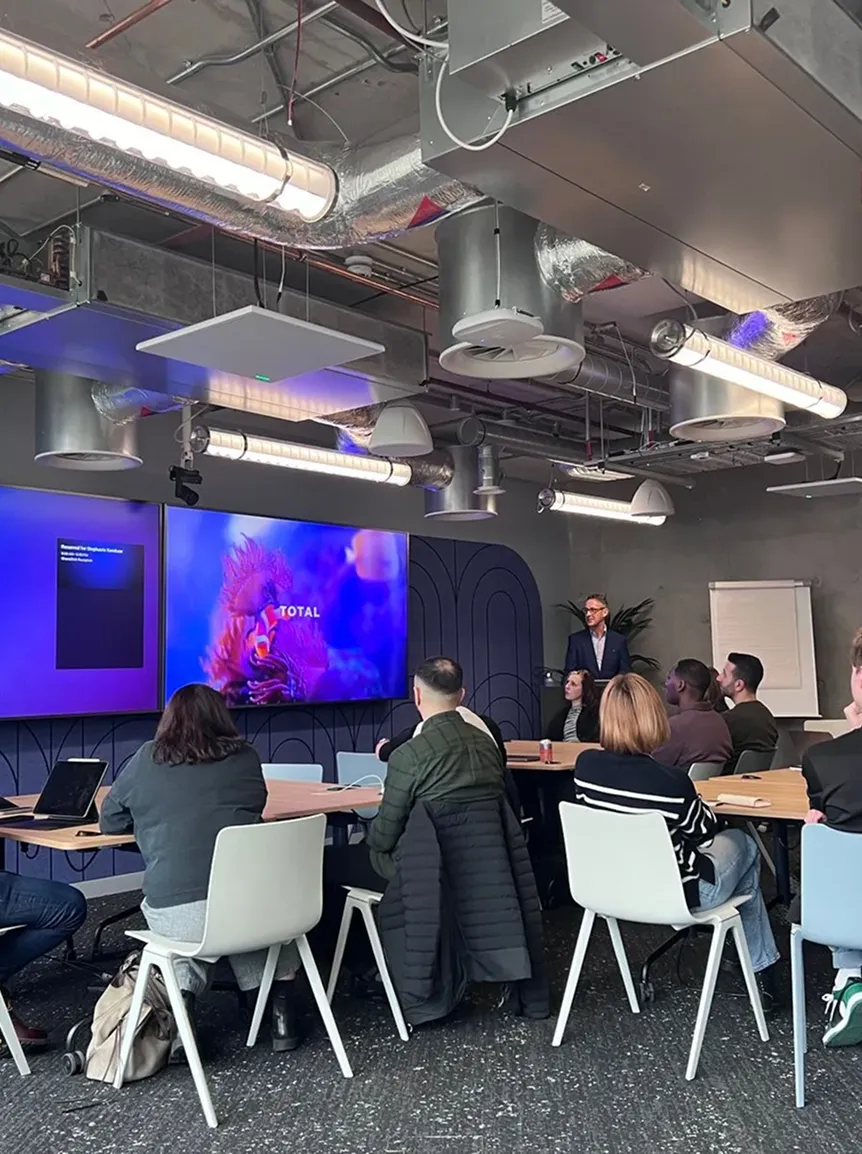
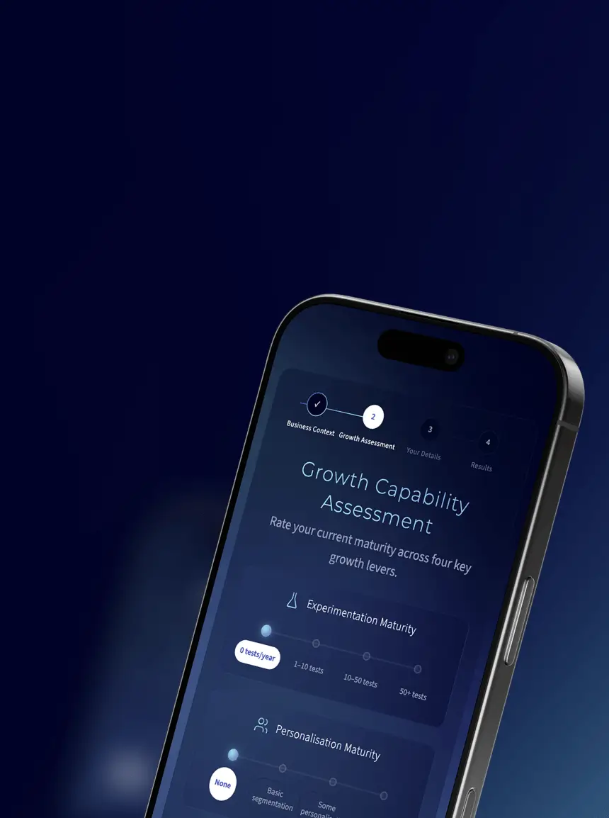
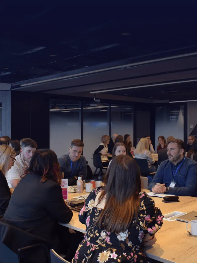
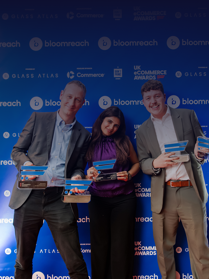
Keeping ahead
There's always lots going on at The Pixel. Have a scroll around and find out about our news and insight. We have our own rolling programme of insight and research that helps us keep our finger on the pulse and our clients ahead of the curve.

%20(1).png)

.png)

.png)


.png)