

Calor Gas is one of the UK’s leading LPG suppliers, serving customers with a wide range of gas products across domestic and commercial use. While the brand has strong market recognition, its digital experience did not fully support the complexity of its product offering - particularly at the point where users make purchase decisions.
The Product Display Page (PDP) plays a critical role in eCommerce journeys, acting as the point where users evaluate products, build confidence, and decide whether to proceed. For Calor, this moment was especially important, as many customers arrive without prior knowledge of LPG products and require clear, structured information to make informed decisions.
The Pixel partnered with Calor to redesign the PDP, with a focus on improving clarity, reducing friction, and supporting real user decision making behaviour.

.avif)
Calor operates in a category where users often lack familiarity and confidence. Customers typically arrive with practical questions around compatibility, delivery, product formats, and pricing structures. While this information existed on the PDP, it was not presented in a way that aligned with how users sought and processed it.
The existing experience was characterised by dense content, unclear hierarchy, and high friction interactions. Key information was often positioned too late in the journey, requiring users to search, interpret, and validate details before progressing. This led to hesitation at a critical stage of the purchase process.
A comprehensive discovery phase brought together multiple data sources, including customer service insights, Trustpilot reviews, behavioural analytics, and competitor analysis. These revealed consistent patterns.
Customers frequently contacted support for clarification on compatibility and delivery. Reviews highlighted similar concerns. Behavioural data showed users navigating the page in a non linear way, moving between sections, missing key information, and interacting with elements that did not meet expectations.
User testing reinforced these findings. Even when relevant information was present, it was often overlooked or misunderstood. The core issue was not the absence of content, but how it was structured and surfaced. The PDP did not effectively support the way users built confidence and made decisions.
.webp)
The redesign was guided by an evidence led approach, ensuring that decisions were grounded in real user behaviour rather than assumption. Insights from discovery were consolidated to define key problem areas, particularly around information hierarchy, content clarity, and interaction friction.
From these insights, a series of hypotheses were developed. These focused on restructuring the page to prioritise decision critical information earlier in the journey, simplifying complex content into more digestible formats, and reducing barriers in key interactions such as pricing visibility and product selection.
Rather than moving directly into final design, interactive prototypes were developed to simulate realistic user journeys. This allowed concepts to be tested in context, ensuring that feedback was based on behaviour rather than opinion.
User testing was conducted with participants across the UK who had no prior experience purchasing LPG products. Task based scenarios were used to reflect real world goals, including adding a product to the basket, checking compatibility, and confirming delivery options. Sessions focused on observing user behaviour, identifying points of hesitation, and understanding how users interpreted and navigated the page.
The findings provided both validation and direction for refinement. Users relied heavily on visual cues to determine compatibility, prioritised delivery information earlier than expected, and occasionally missed key details despite their presence. These insights informed iterative improvements to the structure and presentation of content.
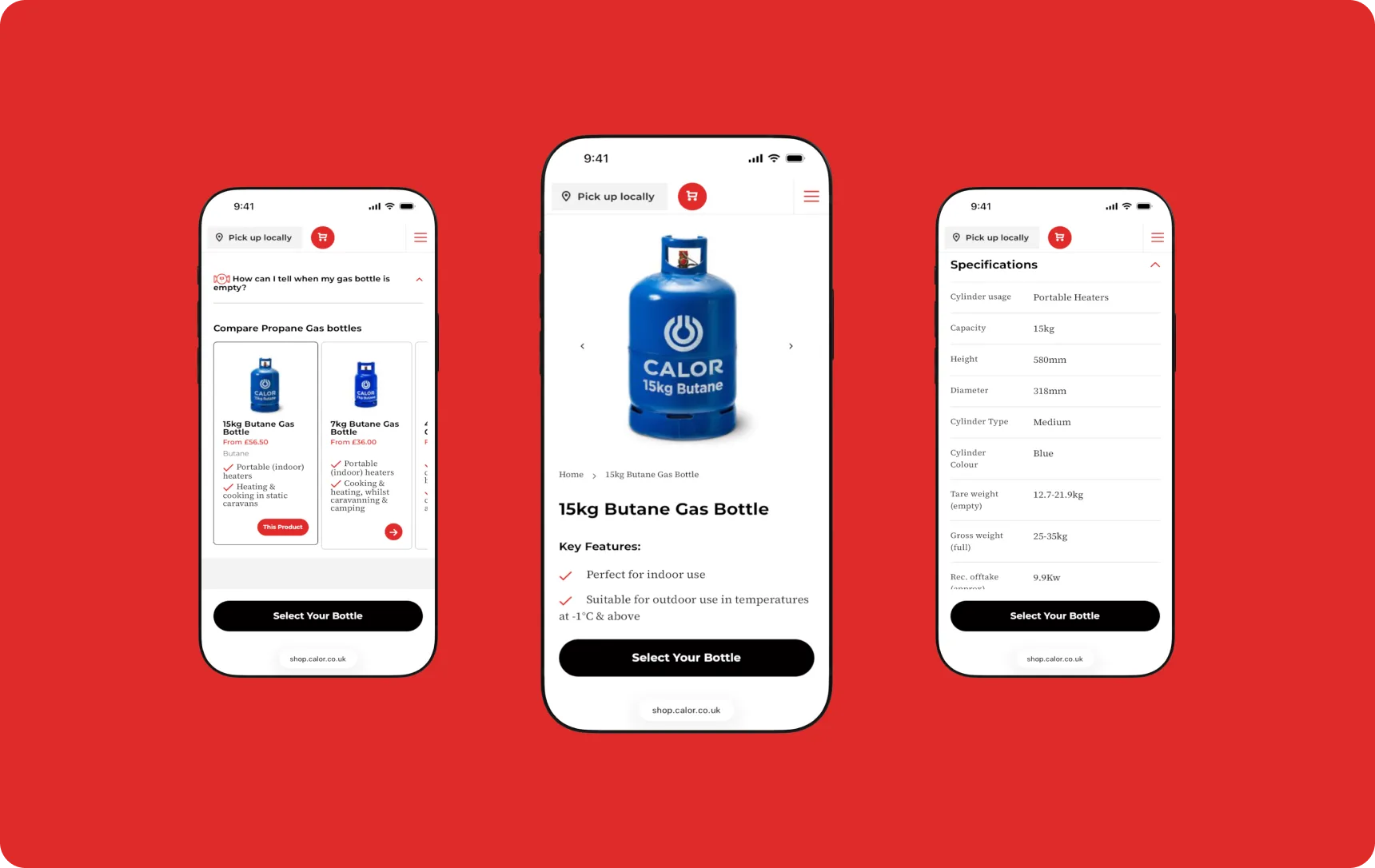
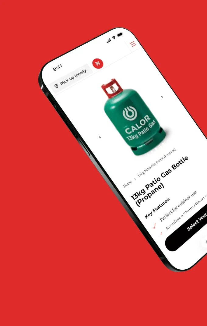
The final solution focused on restructuring the PDP to align with real user behaviour and decision making needs. The page hierarchy was reorganised to surface key information such as delivery and compatibility earlier in the experience, reducing the effort required to access critical details.
Content was redesigned into more scannable, digestible sections, supported by increased use of imagery to aid understanding. Contextual elements such as tooltips were introduced to provide additional information without disrupting the user journey. High friction interactions were addressed, including improvements to how location based requirements and pricing were presented.
The design also accounted for non linear user behaviour, allowing users to move freely through the page while maintaining clarity and context. Enhancements were made across both desktop and mobile to improve accessibility and usability.